The Best UX/UI Design Tips for Good Core Web Vitals
Last updated on
Mar 12th, 2025 |
10 min
TL;DR: By making smart design choices—such as using efficient layouts, optimizing fonts, reducing image bloat, and streamlining navigation—you can enhance both aesthetics and functionality while boosting performance. These optimizations not only help your website pass Core Web Vitals but also improve engagement, SEO rankings, and conversion rates.
Core Web Vitals can seem intimidating, but they shouldn’t be! After all, they’re there to ensure your website connects with its visitors and boosts your goals.
Still, if they make you a little anxious, there are many things you can do to improve your score. The best tactic is to think about aesthetics and functionality (or UX/UI) when designing your website.
Aesthetics affect functionality, and functionality affects aesthetics, and both of them heavily influence CWV. So, if you want to learn more about improving Core Web Vitals through UX/UI design, continue reading for optimized web design tips!
The Basics of Core Web Vitals and UX/UI Design
Let’s rewind a little bit. User experience (UX) and user interface (UI) are two key concepts of web design:
User Experience (UX) is the planning of a website’s functionality with the aim of making it as accessible, intuitive, and efficient as possible.
User Interface (UI) is more concerned with how the website looks and feels, reinforcing seamless interactivity, flow, and processes.
Basically, they encompass how the website is put together and how visitors experience and interact with it. They work to ensure users can get what they need from a site comfortably.
There are different elements to consider when you’re taking care of your website’s UX/UI design, such as:
Layout
Typography
Images and Multimedia
Navigation
White Space
Buttons
Responsiveness
Icons
Forms
Headers
Footers
Animations and Interactivity
On the other hand, Core Web Vitals are metrics that assess your website’s current state and serve as an official Google standard for smooth browsing for your visitors. Core Web Vitals score your site through these parameters:
Largest Contentful Paint (LCP): how quickly you can see the page’s largest content element (like an image or video). web.dev suggests helping your site load in 2.5 seconds or less.
Interaction to Next Paint (INP): how quickly the website responds after an interaction or user input. An INP below or at 200 milliseconds means a page has good responsiveness (web.dev).
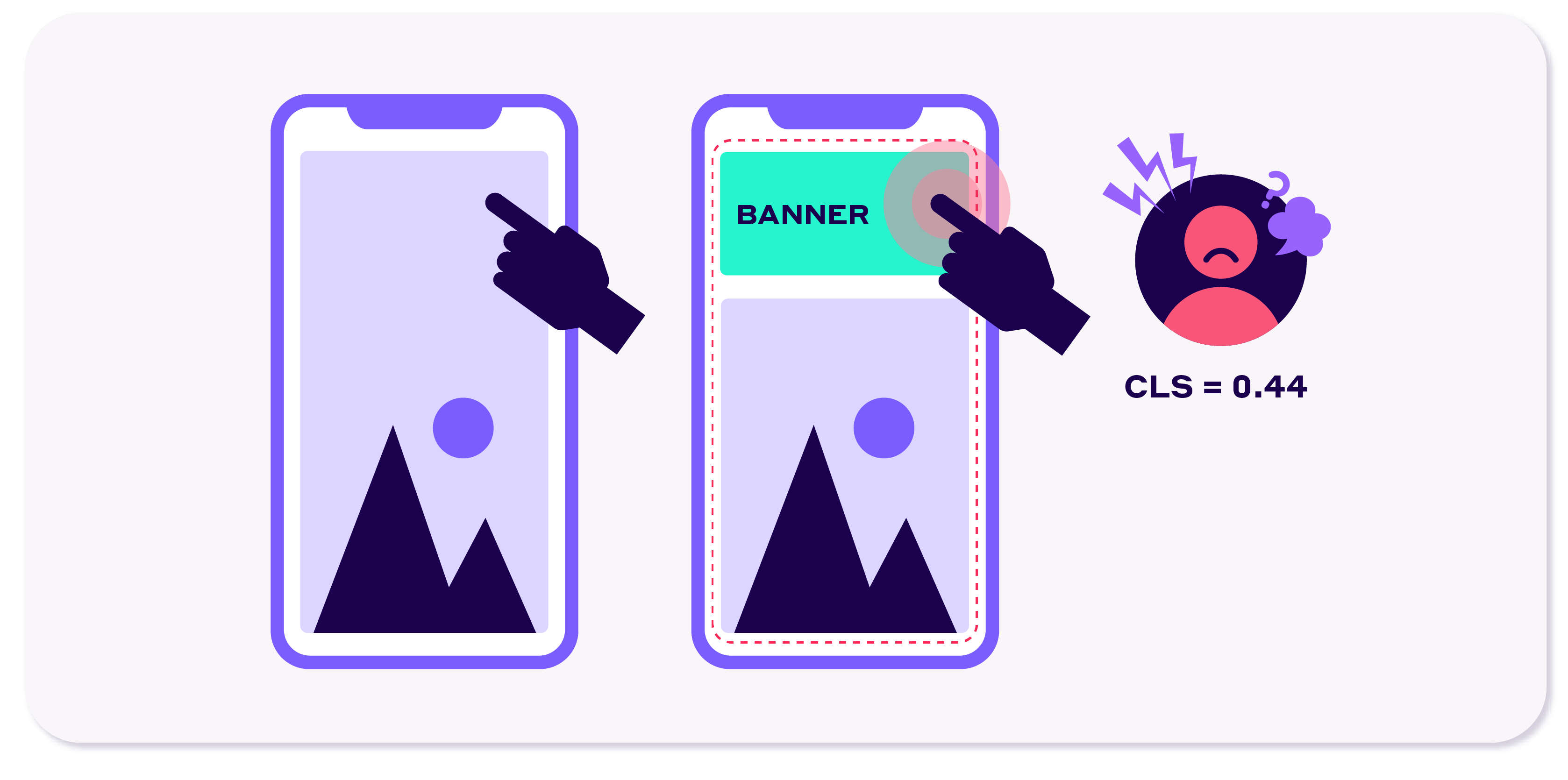
Cumulative Layout Shift (CLS): how stable a loading website is, tracking unforeseen shifts in the layout. In this case, aim to have a CLS score of 0.1 or less to prioritize user experience, web.dev says.
How high or low your score is, as well as how well-designed the website is, can directly impact its success. Google’s ranking algorithm weighs in user behavior and site performance when deliberating on which to show and which to push down.
This is why you need to go about web design with Core Web Vitals in mind to help determine your online presence.
Best UX/UI Design Tips for Core Web Vitals Optimization
Ok, let’s move on to the ways you can use the UX/UI design elements to your advantage for Core Web Vitals optimization.
1. Layout
When you see a website, you notice different elements: the header, the menu, the sidebar, images, etc. The way these elements are arranged is known as the layout (a.k.a. the structure and organization of information).
Layouts are vital for CWVs because they can make a site appealing and user-friendly. More notably, layout design sways loading time, shifts, and the efficiency of the scripts. To optimize a layout for CWV, contemplate the following optimized web design tips:
Design a clean and well-organized layout. Reduce clutter, use white space wisely, and ensure the top content is visible and easily accessible.
Lessen DOM size. This means limiting the elements, their complexity, and the use of excessive nesting to improve rendering and loading.
Use grid systems. Use grids to allow consistency and visual harmony and reduce the need for extra DOM elements.
Consider responsiveness. Design your layout so it’s adaptable to various screen sizes without adding extra strain and complexity to the loading process.
Opt out of large fixed elements. When possible, avoid large objects like sticky headers or have them load asynchronously so they won’t delay LCP.
Set space for dynamic content. Use dimension attributes, CSS aspect ratios, or placeholders to save space for ads, images, or embeds while maintaining visual stability.
When deciding between Core Web Vitals optimization and adding special features in the above-the-fold (like videos/carousels), Mel Findlay, Senior Digital Designer at Envato, states that:
"It comes down to the purpose of the page. If it's a more functional page purely to direct traffic to a specific outcome, we might drop anything that could create a barrier of entry, like heavy videos. But if the page is designed on top of a funnel and needs to be exciting and engaging, and we want to take the customer on an experience, we would go for something more dynamic and sacrifice on load time."
— Mel Findlay, Senior Digital Designer at Envato
2. Typography
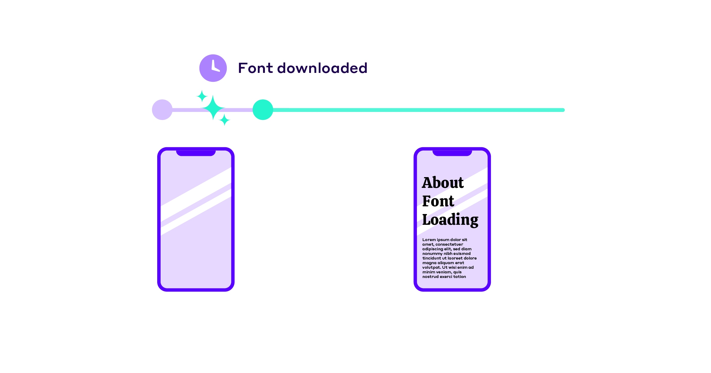
Font choices impact render speed and layout stability, both of which influence Core Web Vitals. Large, unoptimized fonts can block rendering, delaying LCP. Web-safe and well-optimized fonts load faster, while poor font-loading strategies contribute to CLS issues—causing text to shift after loading.
Go for readable, web-safe fonts in legible sizes. Web-safe fonts (like Arial) load faster and are compatible with most browsers. They’re also easy to read at 16px and are legible on large and small displays.
Set a typographic hierarchy. Define distinct styles for headings and the body to ensure accessibility and drive user attention. This also has effects on SEO.
Don’t go overboard with font styles. Have a maximum of 3 font families to keep the design clean and avoid loading issues.
Optimize fonts. When using custom fonts, use font-display: swap in CSS while they load and preload critical font files by tagging them to reduce delays.
3. Images and Multimedia
Images are often the biggest reason for a slow website load time. In fact, about 50% of all bytes on the average page are image bytes. And since 2011, image bytes have increased almost 5x on the median desktop page and over 7x on the median mobile page!
As such, they can make a huge difference when it comes to Core Web Vitals and UX/UI design. This is why you need to take good care of them with these web page design tips:
Avoid excessively large media files. Resize them to make them only as big as they need to be.
Use high-quality, optimized images. Compress images and keep their quality with formats like WebP or AVIF, or enable adaptive images to adjust their quality depending on connection speed.
Implement lazy loading. Use the loading="lazy" attribute in tags to load images only when visible. Avoid doing so in above-the-fold images to allow for quick rendering.
Set explicit size for media. Set a specific width and height in HTML or use CSS aspect-ratio to hold on to space for media and maintain the correct proportions.
Use responsive images. Get help from the srcset and sizes attributes to deliver images depending on the user’s screen size.
But, how do you choose a format that will provide crispy visuals but won’t weigh down your site? In this regard, Mel suggests:
"Typically, a PNG is always going to be good for performance, especially once it's been compressed properly, but if the image is going to be shown at a really large size, I might look for something that has less vibrant colors in it to get the file size down further."
— Mel Findlay, Senior Digital Designer at Envato
4. Navigation
A well-structured navigation system ensures smooth interactions and a frictionless user journey, directly impacting INP (Interaction to Next Paint). Poorly optimized menus—such as heavy dropdowns or JavaScript-intensive navigation—slow down response times and create delayed interactivity.
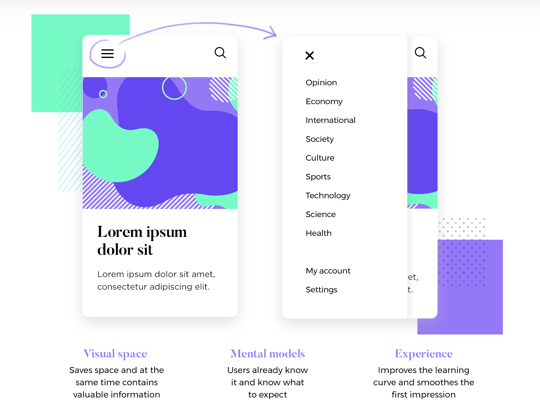
Design intuitive, consistent navigation menus. Have clearly labeled menus and consistent placement. Also, include a search bar for ease of use.
Avoid dropdown menus or complex structures. Limit the navigation structure to two levels and replace dropdowns with simple category pages if possible.
Analyse mobile use. Design collapsible menus that are mobile-friendly and keep them at a minimum of 48x48px so they’re easily tappable.
Limit hover effects and heavy animations. Don’t overcomplicate interactions and go for simple hover effects or click-activated options. If needed, use smooth, lightweight animations.
Keep the navigation visible and accessible. Provide a way to get immediate access to navigation (like using a recognizable hamburger menu).
5. Whitespace (Negative Space)
Whitespace is more than just an aesthetic choice—it improves readability, usability, and performance. Excessive clutter increases DOM size, requiring more processing power and affecting LCP. A well-balanced design with proper spacing between elements minimizes layout recalculations, prevents CLS issues, and ensures users see content faster without sudden shifts.
Moreover, it helps stability, smoothness, and engagement. Get whitespace working in your favor with these optimized web page design tips:
Create breathing room between elements. Add margins and padding between elements to give the eyes a resting spot.
Avoid overcrowding. Embrace a minimalist approach, and don’t overstuff your site to let key elements stand out.
Maintain consistent spacing. Establish a set spacing system or layout grid that has space for dynamic content.
Avoid dynamic resizing. When possible, set dimensions for items like dropdown menus to ensure the sizing won’t shift and the content won’t get pushed down.
Adapt for responsive design. Go over whitespace in regards to responsiveness.
But, how much whitespace should you include on your landing page? How do you balance including all the info you need above-the-fold and having a minimalist approach to web design? To find that sweet spot, Mel tells us:
"… depends on the purpose of the page, but normally I would say that above-the-fold and the first scroll should have the most important pieces of information… anything below that, we should be okay if no one sees it.
In short, be very critical about what is important and edit your above-the-fold design with the highest standard in mind. This will allow the design to have the necessary whitespace to provide an enjoyable and effective experience. For example, the name of a business, its phone number, and the site’s menu should be given priority. The “About Us” blurb? Not so much."
— Mel Findlay, Senior Digital Designer at Envato
6. Buttons
Buttons play a key role in interactivity and responsiveness, directly affecting INP. Oversized, unoptimized buttons delay interaction times, while poor touch-target design leads to frustration on mobile devices. Ensuring buttons are easily clickable, properly spaced, and not dependent on heavy scripts helps maintain fast response times and smooth user interactions. Not to mention—better business metrics like conversion rates and
Use strong contrast and clear labeling. Design them with stand-out, high-contrast colors and short, descriptive, and concise text.
Make them tapable or clickable. They should be a minimum of 48x48 pixels and have ample spacing around them to avoid clicking nearby elements.
Provide minimal visual feedback. Use simple hover effects (like color change) to provide feedback and stay away from excessive or slow animations.
Keep the design simple and consistent. Have a signature style for buttons and use it across the website to make them instantly recognizable.
7. Responsiveness
A responsive design ensures that a website adapts smoothly to different screen sizes, preventing content reflows that harm CLS. Poorly executed responsive design can introduce breakpoints that trigger unnecessary layout shifts, making a page feel unstable. Moreover, mobile users often work with devices with much less CPU power and unstable networks that make fast resource loading critical.
Design with a mobile-first approach. Cater to smaller screens (guaranteeing successful interactions and user experiences) and progressively design for larger ones.
Use fluid grids, flexible images, and media queries to adapt styles to different screens and ensure content resizes proportionally.
Avoid hidden mobile elements. Only design content that can be viewed across all devices and dynamically load assets for specific devices (like smaller images for mobile).
Test designs on multiple devices. Use various physical devices, Chrome DevTools, or other browser tools to experiment with your site’s design and functionality.
When it comes to responsive design, Mel states that:
"… I actually think they (mobile vs desktop) should be considered individual designs these days, and should be designed with their own set of thinking. There might be some things desktop gets that mobile doesn’t and vice versa, and we want both experiences to be great, not just re-sized from the first design with no thinking on the platform it will be shown.
The most crucial thing to remember is that users should have a grand-ol-time on your website, whether they visit through their desktop computer, mobile devices, or microwave."
— Mel Findlay, Senior Digital Designer at Envato
8. Icons
Icons are often overlooked in performance optimization, but unoptimized icon fonts and excessive HTTP requests can slow down LCP and INP. Using SVGs instead of icon fonts, limiting unnecessary icon variations, and preloading critical icons help improve performance while keeping interactions snappy and load times minimal.
Use vector-based, scalable icons (e.g., SVG). Minimize HTTP requests and reduce path complexity for enhanced performance.
Minimize icon fonts. Use SVGs or web-based icon libraries or employ font-display: swap to ensure icon fonts won’t slow down a website’s loading process.
Keep icon styles consistent. Establish guidelines and avoid mixing styles for a cohesive look, feel, and a refined user experience.
Mel gives an extra tip about icons:
"Generally, if you are using a UI icon, we wouldn’t use anything past 64x64px or anything lower than 24x24px, but icons are very light, so they don’t impact page speed."
— Mel Findlay, Senior Digital Designer at Envato
9. Forms
Forms are a key part of user engagement, but slow-loading or poorly structured forms can drastically affect INP and LCP. Forms with too many fields, unnecessary animations, or dynamic resizing cause input delay and layout instability. Streamlining form design ensures users experience fast response times, clear interactions, and fewer performance disruptions.
And here are the web performance optimization tips you can take on:
Simplify forms. Minimize the number of fields, use logical groupings, and break complex forms into steps or sections to ease the process.
Avoid dynamically loading or resizing forms. Have a fixed layout, avoid inline resizing, and preload certain elements to avoid unexpected changes.
Use clear labels and placeholders. Label fields clearly and use descriptive placeholders to guide users. Create an “error message” in case it’s needed.
Design mobile-friendly forms. Use flexible layouts and keep fields and buttons at least 44x44 pixels for tapping.
10. Animations and Interactivity
While animations enhance user engagement, excessive or unoptimized animations introduce render delays and long main-thread tasks, leading to poor INP scores. Heavy JavaScript animations can become render-blocking elements, slowing down LCP, while animations affecting layout positioning trigger CLS shifts.
Use animations sparingly. Don’t overwhelm your audience with animations that can create visual clutter and cognitive overload.
Use CSS for animations. Use transform and opacity, and don’t animate width, height, margin, or padding so as not to trigger layout recalculations.
Implement smooth, subtle transitions. Keep transitions fast (between 200-300 milliseconds) and maintain consistent speeds and styles for a smooth and cohesive experience.
Make animations/interactivity performance-optimized. Don’t overuse JavaScript animations, and avoid long-running animations to prevent unnecessary strain.
Of course, animations are extremely fun, but how much is too much? Mel has an answer for that, too:
"I would say it’s too much animation if the animation is competing with each other, making it hard to focus on information… For example, I wouldn’t put two high-energy surfing videos side by side on a page, but I would if the animation was subtle and supported the information. Also, if you have more than 3 animations, your page load is going to get impacted, so I would say there is a limit to it!"
— Mel Findlay, Senior Digital Designer at Envato
Alternatively, consider static site generation as one of the most recent trends in web design to significantly lower resource loading and boost performance.
FAQ
What UX/UI changes improve my Largest Contentful Paint (LCP) score?
To improve LCP, use a clean, well-structured layout, optimize images with next-gen formats like WebP or AVIF, defer non-critical JavaScript, and preload important assets like fonts and hero images. Avoid large, above-the-fold elements that delay rendering.
How do web fonts affect Core Web Vitals, and what’s the best way to optimize fonts?
Fonts impact both LCP and CLS by loading entire font families that are not used on a web page. To optimize them, use web-safe fonts, set font-display: swap to prevent invisible text, preload critical font files, and minimize the number of font families to reduce load time.
How can I prevent Cumulative Layout Shift (CLS) with better UI design?
To avoid CLS issues, set explicit height and width attributes for images and videos, reserve space for ads and dynamic content, avoid injecting elements late in the loading process, and use CSS aspect ratios to stabilize layouts.
How do animations and interactivity affect Interaction to Next Paint (INP)?
Heavy animations and JavaScript-driven interactions can delay INP. Use CSS-based animations instead of JavaScript, limit excessive hover effects, and prioritize smooth, lightweight transitions that don’t block main thread execution.
How can I test my Core Web Vitals in real-time?
Google’s PageSpeed Insights, Lighthouse, and the Chrome User Experience Report (CrUX) provide detailed Core Web Vitals reports which are updated every 28 days. However, if you want real-time monitoring, tools like WebPageTest and Chrome DevTools Performance Panel allow you to measure page load speed, layout shifts, and interaction delays as they happen.
Do design-heavy websites always perform worse in Core Web Vitals?
Not necessarily. While animations, high-resolution images, and custom fonts can slow down a site, strategic optimizations—like lazy loading, font subsetting, and efficient CSS animations—help maintain visual appeal without sacrificing speed. The key is smart resource management, not just minimalism.
Can I optimize Core Web Vitals without changing my site’s design?
Yes, but it’s harder. Code-level improvements, such as reducing render-blocking resources, enabling efficient caching, and optimizing third-party scripts, can boost Core Web Vitals without altering your layout. However, some visual tweaks (like fixing layout shifts) may still be necessary for optimal scores.
Lora has spent the last 8 years developing content strategies that drive better user experiences for SaaS companies in the CEE region. In collaboration with WordPress subject-matter experts and the 2024 Web Almanac, she helps site owners close the gap between web performance optimization and real-life business results.
We use cookies to deliver our services and to analyze traffic. Learn More
Essential Cookies - these are required for basic functions of our website and for traffic analysis.
Optional Cookies - help us better learn how you use our system so we can improve our services.