


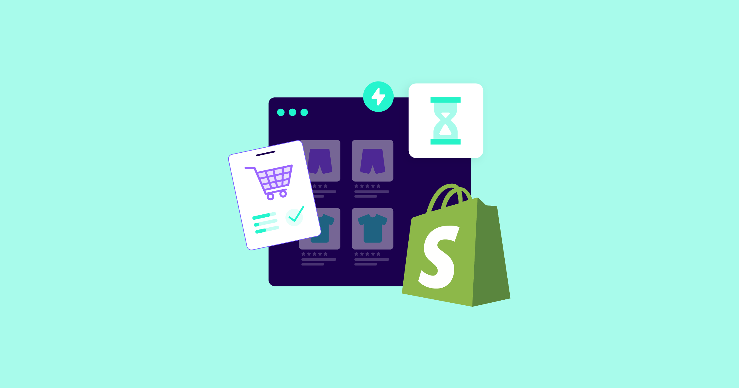
How to Speed Up Your Shopify Website (2024 Guide)
Last updated on Jun 30th, 2024 | 12 min
Once you start with NitroPack, you can freely choose your integration platform.


Everything you need to know about
NitroPack features and compatibilities.
Whether you run a blog or
an agency, we have a
partnership opportunity for you!
The place to learn how to
improve your web performance,
how to get the most out of
NitroPack, and what is coming
next to our product.
With only 5% to 10% ecommerce success rates for 4.8 million Shopify stores, site owners face challenging odds.
So, it’s natural to ask yourself:
“What are the few successful Shopify store owners doing right?”
As web performance experts, we dig deep into the technical aspects of Shopify websites and uncover bottlenecks that site owners often overlook.
From this guide, you’ll learn practical techniques for optimizing your website for conversions without disrupting your business.
But first…
Shopify has grown into a CMS that greatly cares about web performance and how users experience websites in the real world.
As a platform, Shopify invests heavily into providing a robust infrastructure that alleviates some of the heavy lifting from site owners with:
As a result, Shopify websites boast impressive performance, loading speed, and server speed compared to other major commerce platforms. Some of the latest statistics include:

However, web performance is a collection of site-specific challenges, and a cookie-cutter approach is not a cure for all. From render-blocking resources to unused JavaScript and CSS, let’s inspect why Shopify websites struggle with slow user experiences.
Shopify websites become slow due to gradual bloat. As businesses grow, they tend to accumulate features, apps, and custom code, all of which can impact user experience and site speed.
In fact, this is a common issue in web performance for all websites out there. In Shopify, most slow-loading websites have the following issues in common:
Another mistake we often see Shopify store owners make is overlooking how the mobile version of the website performs. With 79% of Shopify's total traffic coming from mobile devices, it’s crucial you offer the best mobile user experience to your site visitors.
A Shopify speed score above 50 is considered good, and anything above 70 is rated as excellent. However, it’s important to know that your Shopify speed score does not reflect the actual speed and user experience as it’s generated in a synthetic (lab) environment. Rather, it leans more toward evaluating page structure and content.
To understand how your Shopify store performs in reality, you should evaluate user experience over time with the help of Google’s Core Web Vitals:

These three performance metrics are the standardized way to determine how fast, responsive, and stable your Shopify site is on mobile and desktop when real visitors browse it.
For ecommerce websites, anything above 2 seconds of page load time is considered sub-optimal, with users losing patience and abandoning stores at precisely the 2.75s mark.

How to Improve Core Web Vitals (Webinar wi/ NitroPack and Google)
According to a report by Deloitte, even a 0.1-second delay negatively impacts the entire buyer’s journey on ecommerce websites:
In 2021, Google updated its ranking factors to include and prioritize signals like page experience, Core Web Vitals, and Helpful Content System. These signals are used together to determine a website’s browsing experience and rank it in SERPs.
In summary, slow site speed has a negative ripple effect across your Shopify store user experience, important business metrics, SEO rankings, revenue, and even SEA budgets because of decreased page quality ratings.
With almost 80% of Shopify traffic coming from mobile devices, all the following tips are focused on improving your Shopify story mobile performance and speed.
But before you dive deep into manual optimizations, take the time to evaluate your site with Google’s questionnaire on page experience:
Answering these questions will help you pinpoint problematic aspects of your site’s performance and also serve as the groundwork for an optimization strategy.
Most ecommerce websites fail the Core Web Vitals assessment on mobile because they typically design the mobile version as a scaled-down version of the desktop site.
While this approach saves time, it completely disregards best practices for mobile user experience. This will make it harder for your mobile site visitors to browse and buy from their smartphones, resulting in disappointing sales at the end of the month.
A rule of thumb (pun intended) for mobile viewports is to evaluate which elements are essential for a user to make a successful purchase. With smaller real estate on the mobile screen, you should ask yourself:
Optimizing for Core Web Vitals on mobile devices requires a set of optimization techniques. Here, we break them down according to the three most important performance metrics:
1. Improving Largest Contentful Paint on mobile
Largest Contentful Paint (LCP) measures how quickly the largest visible content element (such as an image, video, or large text block) loads and becomes visible to users. For mobile users, a fast LCP is critical for maintaining engagement.
Techniques that improve LCP on mobile include (browser caching and CDN excluded since Shopify already does that for you pretty well):
2. Improving Interaction to Next Paint on mobile
Interaction to Next Paint (INP) measures the time it takes for a page to respond to user interactions like clicks, taps, or key presses. Quick responsiveness is crucial for a smooth user experience on mobile devices.
Here are several effective strategies to improve INP on mobile:
3. Improving Cumulative Layout Shift on mobile
Cumulative Layout Shift (CLS) measures a page's visual stability and how much the layout shifts unexpectedly as it loads. Minimizing CLS is essential to prevent users from accidentally clicking the wrong elements due to shifting content.
Several techniques you can implement today to improve CLS on mobile are:
The above-the-fold sections on all your site pages must show up as quickly as possible to leave the user with a perception of instant loading. Lazy loading is an effective performance technique used to delay non-critical resources outside the viewport until the user starts to scroll down.

By lazy loading offscreen images, you:
Minimizing redirects involves reducing the number of times a user's browser is directed from one URL to another before reaching the final destination. Each redirect creates an additional HTTP request and response cycle, which can slow down the page load time.
Minimizing redirects is particularly important for mobile devices for several reasons:
Here are some steps to minimize redirects on mobile:
1. Use tools like Google PageSpeed Insights, Screaming Frog, or GTmetrix to identify unnecessary redirects on your site.
2. Avoid using redirects for tracking purposes; instead, use analytics tools that don't require additional redirects.
3. When redirects are necessary, use server-side redirects (such as 301 or 302 redirects) instead of client-side redirects (like JavaScript or meta-refresh). Server-side redirects are faster and more efficient

4. Reduce redirect chains by redirecting directly to the final URL.
Example: Instead of A -> B -> C, redirect A directly to C.

5. Ensure all internal links point directly to the final destination URL. This prevents the browser from having to follow unnecessary redirects.
6. Use canonical tags to inform search engines about the preferred version of a URL, which helps avoid duplicate content and unnecessary redirects.
7. Regularly scan your site for broken links and fix them to avoid redirection loops and improve user experience.
Liquid is Shopify's templating language, which allows developers to create dynamic content in their online stores. Over time, Liquid code can become cluttered and inefficient, leading to slower page loads and a less responsive website.
Optimize your Liquid code effectively by following these steps:
1. Remove unnecessary code: Identify and eliminate any redundant or unused code snippets and tags in your Liquid files.
2. Optimize Loops:
3. Use conditional statements wisely:
Example: Instead of multiple nested conditions, use logical operators to simplify:

4. Minimize HTTP Requests:
5. Optimize Include Statements:
By cleaning up your Liquid code, you ensure that your Shopify store runs efficiently on mobile devices, providing a better user experience, improving SEO rankings, and enhancing overall site performance.
Optimizing your fonts involves reducing the impact of web fonts on your website's performance. This includes using efficient loading techniques, minimizing the number of font variants, and ensuring that text is displayed quickly, even if custom fonts take time to load.
Here are several effective ways to optimize fonts on mobile:
1. Use WOFF2 format for modern browsers and compress font files
2. Use system fonts: System fonts are pre-installed on devices, so they don’t require additional downloads, resulting in faster load times.
3. Limit web fonts: Web fonts must be downloaded by the browser, which can slow down page load times. Limiting the number of web fonts reduces the amount of data that needs to be downloaded.
4. Subset fonts: Subsetting involves including only the characters that are actually used on your web pages, reducing the font file size.
5. Use font display Options: The font-display property controls how text is rendered while the font is loading. Using the swap option ensures that text is displayed immediately using a fallback font until the custom font loads.
Bonus expert tips:


Setting up a web performance budget involves defining specific performance goals or limits for various metrics that affect your website's load time and user experience.
These metrics can include page size, number of HTTP requests, Time to Interactive, and more. The idea is to establish thresholds that your website should not exceed, ensuring it remains fast and efficient.
Web performance budgets are a great way for development, product, and design teams to:
You start off by identifying key performance indicators for your mobile performance and write them down as your benchmark. Then, you create a second column with the ideal thresholds. And finally, you set your own goals you’d like to reach in a set period of time.
For example:

Tools like Google PageSpeed Insights, GTmetrix, and Shopify’s own speed report can help you monitor and analyze your website’s performance.
It’s a good practice to test your site’s speed regularly, especially after making significant changes or adding new features. Monthly tests can help you keep track of performance trends and address issues promptly.
Yes, third-party apps can add extra scripts and functionalities that may slow down your site. It’s important to regularly review and remove any apps that are not essential to your business.
Tools like Shopify’s built-in image analysis or Google PageSpeed Insights can help identify large or unoptimized images that need compression or resizing.
Best practices include minimizing the use of JavaScript, deferring non-critical scripts, and using asynchronous loading to improve performance.
Choose a lightweight, responsive theme regularly updated and supported by the developer. Avoid themes with excessive built-in features that you won’t use.
Yes, integrating social media widgets can slow down your site if they add additional scripts. Consider using static links or lightweight alternatives to social media integrations.
Structured data helps search engines understand your content better and can enhance your SEO. Implementing schema markup can improve your visibility in search results.
Prepare for high traffic by optimizing your site, using a CDN, ensuring your theme is efficient, and leveraging Shopify’s scalable infrastructure.
Common mistakes include overloading the site with apps, not optimizing images, using a heavy theme, neglecting mobile optimization, and failing to regularly monitor performance.

Lora has 7+ years of experience developing in-depth, specialized content for SaaS companies in the CEE region. She has sourced and collaborated with subject-matter experts on site speed optimization for WordPress, Core Web Vitals, and the future of web performance. "If you can't explain it to a 7-year-old, you've not researched it well enough" is Lora's guiding principle when publishing professional insight for complex technical topics.