TL;DR: Measuring user experience (UX) is essential for website success, influencing engagement, conversions, and SEO rankings. This guide explains how to measure user experience using key metrics—Core Web Vitals, bounce rate, and user feedback — to analyze and improve performance, design, and business outcomes.
Knowing how to measure user experience (UX) is not just about making your site look good. Optimizing UX is all about performance, how easy the site is to use, and whether it meets users' expectations.
A slow, clunky site frustrates users and tanks rankings, while a well-optimized one fosters engagement, trust, and revenue growth. Good UX affects everything, from visitor retention to conversion rates.
In this article, I’ll show you how to measure user experience effectively to create a site that performs, converts, and keeps users coming back.
Understanding User Experience
Before learning how to measure user experience, it’s essential to fully grasp what UX actually means.
Many assume user experience is just about visual design — how a website looks. Others think it’s purely about site speed. In reality, it's not limited to aesthetics or speed but includes technical performance and content clarity.
UX covers a visitor's entire journey on your site, from first click to final conversion. A good UX is made up of several interconnected elements, including:
- Technical Performance: How fast, stable, and responsive your website feels during interaction.
- Content Clarity: How easily users can consume, trust, and act on your messaging or offers.
- Visual and Structural Design: How intuitive, accessible, and emotionally appealing your layouts, colors, and navigation are.
- User Satisfaction and Outcomes: How successfully does the experience align with users’ goals and your business goals?
By understanding these layers, you’ll be better equipped when we explore how to measure user experience in ways that truly matter.
User Experience in Web Development
In web development, user experience focuses on creating a technically flawless environment where users can navigate, interact, and complete actions without friction.
Google’s Core Web Vitals—Largest Contentful Paint (LCP), Interaction to Next Paint (INP), and Cumulative Layout Shift (CLS)—highlight the importance of speed, stability, and responsiveness.
Key web development factors impacting UX include page experience signals like:
- Page Load Speed: Faster load times make a better impression, keeping visitors engaged and reducing bounce rates.
- Visual Stability: Sudden layout shifts, especially during loading or actions like checkout or sign-up, confuse and frustrate users.
- Interactivity and Input Delay: Users should be able to interact quickly and reliably with buttons, forms, and navigation without lag.
- Responsiveness Across Devices: With the majority of traffic coming from smartphones, mobile-first performance is no longer optional.
- Security and Trust Signals: HTTPS encryption, secure checkout processes, and error-free browsing contribute to a positive, trustworthy experience.
Poorly optimized code, unstable elements, or laggy interactions can quickly sabotage even the most beautiful designs. Indeed, as explained in Attrock bad SEO guide, a sluggish site disrupts engagement and affects user satisfaction and SEO rankings.
User Experience in Web Design
Visual clutter or confusing interfaces can overwhelm, while clean layouts, accessible colors, and intuitive navigation build confidence and flow.
Cluttered layouts, like the one below, overwhelm users with competing elements, unclear navigation, and poor visual hierarchy. They make it hard for users to focus, leading to confusion, early exits, and reduced task completion.

Image via ARNGREN
Conversely, a clean, well-structured design helps users navigate effortlessly and encourages them to stay engaged longer. This design from Oura uses clear visual hierarchy and intuitive navigation to guide users smoothly towards their goals.

Image via Oura
That’s why it’s essential to know how to measure user experience from a design perspective. Consider metrics and design elements that reflect how users interact with and navigate your website, such as:
- Content Readability: How comfortably users consume information affects time on page and scroll depth.
- Navigation Clarity: The bounce rates, path analysis, and task completion rates reflect how easily users find what they need.
- Visual Hierarchy: You can measure how effectively your layout guides attention to important elements through heatmaps and eye-tracking.
- Responsive Adaptation: How seamlessly your design functions across device types is visible in device-specific engagement metrics.
- Emotional Resonance: You can measure how your aesthetic choices evoke desired feelings through sentiment analysis and feedback.
User Experience in Business
User experience doesn’t end with a page view — it’s directly tied to business performance. From logistics management to retail platform websites, seamless UX ensures optimal business performance.
From a business standpoint, here’s how to measure user experience in terms that matter to revenue and retention:
- Conversion Rate: This is the clearest sign of your UX working because bottlenecks in layout, messaging, or performance often cause drop-offs.
- Funnel Abandonment: Knowing where users exit helps you pinpoint problem areas in your customer experience or content flow.
- Net Promoter Score (NPS): This survey-based metric shows how satisfied users are and how likely they are to recommend your brand.
- Support Tickets or Complaints: A spike in help requests often signals UX friction, confusion, or broken functionality.
- Customer Retention Rates: Great UX encourages repeat visits and long-term loyalty, which are more valuable than one-time conversions.
How to Measure User Experience: Core UX Metrics You Should Track
Understanding how to measure user experience is essential for optimizing engagement, satisfaction, and conversions. The essential UX indicators that provide meaningful insights into your website’s performance include:
Google’s Core Web Vitals (LCP, INP, CLS)
Largest Contentful Paint (LCP) measures when the most significant content element becomes visible within the viewport. This metric directly reflects perceived loading speed, which is how quickly users see what matters most.

An optimal LCP is ideally under 2.5 seconds. A slow LCP creates the impression of a sluggish site, especially on mobile. You can track LCP using tools like PageSpeed Insights or NitroPack’s performance reports.
Improve the LCP by optimizing images, reducing server response time, and prioritizing above-the-fold content.
Interaction to Next Paint (INP) replaces First Input Delay (FID) and evaluates how fast your site responds to user actions like clicks, taps, or keystrokes. It measures when a user initiates an action and the page renders a visual response.
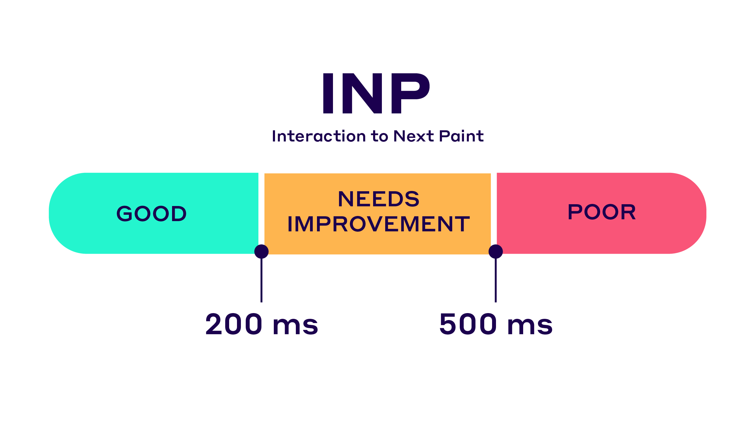
A good INP is under 200 milliseconds. If users experience delays after clicking a button or opening a menu, frustration builds fast. Heavy JavaScript, complex animations, poor event handling, or bloated code are common culprits.
To improve INP and create a sense of immediate feedback, streamline scripts, reduce third-party tools, and ensure responsive interactivity under real-world conditions.
Cumulative Layout Shift (CLS) tracks how much page content shifts unexpectedly during load, like buttons jumping or text moving as ads load.

A low CLS (below 0.1) means a visually stable experience. Meanwhile, a high CLS is often caused by unspecified image dimensions and using the wrong web fonts.
To reduce the CLS, set size attributes for images and embeds, and avoid inserting content above already loaded elements. Also, test layout stability with tools like Lighthouse or the Web Vitals Chrome extension.
Page Load Time
Page Load Time measures how long it takes for a webpage to fully display all elements. Users expect pages to consistently load under three seconds; any longer, they’re likely to leave.
Unlike LCP, which tracks a specific element, this metric covers the total load process. Slow load times often result from unoptimized images, heavy scripts, or server issues.
Tools like Google PageSpeed Insights, GTmetrix, or NitroPack can help monitor this metric. Improve load speed by compressing files, enabling lazy loading, and reducing third-party scripts.
Bounce Rate
Bounce rate represents the percentage of single-page sessions visitors leave without further interaction. You can calculate it by dividing single-page visits by total visits, then multiplying by 100 to get a percentage.
While a high bounce rate can suggest poor UX, context matters. Blog posts or landing pages with a single purpose may naturally have higher bounce rates. Confusing layouts, slow loading, or unclear CTAs often drive users away.
Segment bounce rate by traffic source, device type, and user demographics to identify specific experience problems rather than making broad generalizations.
Session Duration
Session duration reflects a user's stay on your site and user satisfaction. Longer sessions generally signal stronger engagement and interest, though very long times without interaction might also indicate confusion.
Tools like Google Analytics provide detailed session tracking.
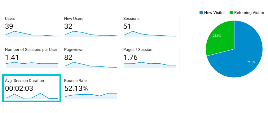
Image via PPCexpo
Before considering how to measure user experience, it’s important to improve the session duration, enhance content flow, and include interactive elements (like videos or quizzes). Also, ensure seamless transitions between pages or sections.
Scroll Depth
Scroll depth tracks how far users scroll down a page. If users abandon the page before reaching the halfway point, it may indicate that your content or design isn’t resonating with them. Low scroll depth can signal weak introductions, poor visual hierarchy, or information overload.
You can use tools like Google Tag Manager and Hotjar, which allow you to set scroll triggers and visualize heatmaps. However, to improve engagement, break content into digestible sections, add visual cues, and place key messages at the top of the page.
Click-Through Rate (CTR)
CTR measures how often users click links, buttons, or CTAs compared to how often they’re viewed (impressions). Low CTR suggests unclear messaging or value, weak placement, or poor design.
You can track CTR using Google Analytics event tracking, heat mapping tools like Hotjar and Mouseflow, or dedicated A/B testing platforms like Optimizely. Increase your click-through rate by making links visually distinct and using clear CTAs.
Conversion Rate (CR)
Conversion rate is the percentage of users who complete a desired action, like signing up, purchasing, or booking a demo. It directly reflects how effectively your site guides users toward business goals.
Low rates may indicate friction in forms, poor mobile optimization, or unclear messaging. Use tools like Google Analytics 4, Semrush, Mixpanel, or Matomo to monitor CR performance.
Improve conversion by simplifying steps, strengthening CTA placement, and streamlining navigation across devices.
Funnel Drop-off
Funnel drop-off analysis identifies exactly where users abandon multi-step processes like checkouts, registrations, or sales operations sequences. Knowing where users exit helps you diagnose UX issues in context.
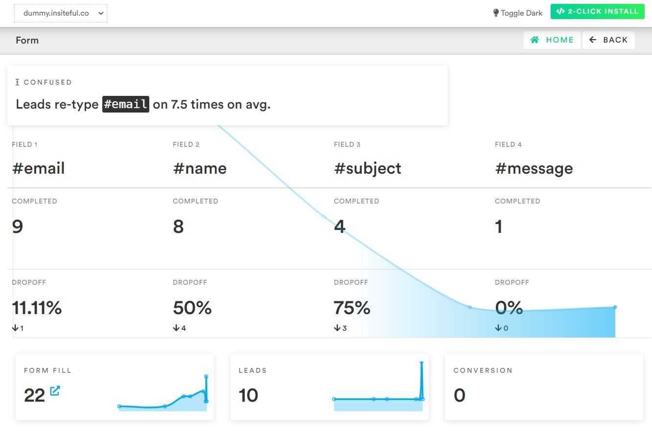
Image via ca
Track these sequences using funnel visualization tools in Google Analytics 4, dedicated journey mapping platforms like UXCam, or session recording tools like FullStory. Complement these insights with heatmaps and behavioral tracking tools like Hotjar or Crazy Egg to get a fuller picture of user interactions.
Reduce drop-off by minimizing required fields, offering autofill options, clarifying progress indicators, and testing variations through A/B experiments.
User Feedback and Surveys
Not all UX insights come from numbers. Qualitative data provides real user perspectives, revealing the “why” behind user behavior.
Use tools like Google Forms, Hotjar, Qualaroo, SurveyMonkey, post-interaction emails, or usability testing platforms like UserTesting to collect this data. Also, search for patterns in complaints, requests, or confusion points.
Asking simple questions like “What stopped you from completing your task today?” often uncovers hidden friction you won’t catch with analytics alone.
Implementing a UX Measurement Strategy
Tracking metrics is important, but without a clear strategy, the numbers lack context and direction. A UX measurement strategy brings consistency, context, and clarity to your efforts.
Start by identifying your goals: Do you want to increase conversions, reduce bounce rates, or improve your website’s speed?
Then, choose the right combination of metrics (quantitative and qualitative) to monitor progress. Use tools like Google Analytics, NitroPack, Hotjar, or GA4 to collect data, and regularly review performance benchmarks.
Example: A UX Measurement Strategy for a SaaS Website
Goal: Increase trial signups for a SaaS development site by 20% in 3 months
Metrics to Track:
1. Conversion Rate on the Signup Page
- How to Track: Set up conversion goals in Google Analytics 4 or use tools like Hotjar and Mixpanel to track signup completions versus page visits.
- Benchmark: Aim for a 2-5% conversion rate as a starting point. Set your baseline from the current performance and aim for 15-25% improvement.
- Pro Tip: Monitor daily and weekly trends to identify patterns, and segment conversions by traffic source to identify your most valuable user channels.
2. Core Web Vitals (LCP, INP, CLS) and Page Load Time
- How to Track: Use Google PageSpeed Insights, Google Search Console’s Web Vitals report, or tools like NitroPack, GTmetrix, and WebPage Test.
- Benchmarks:
- Largest Contentful Paint (LCP): Under 2.5 seconds
- Interaction to Next Paint (INP): Under 200ms
- Cumulative Layout Shift (CLS): Under 0.1
- Overall page load time: Under 3 seconds
- Pro Tip: Regularly test key pages on both desktop and mobile to get a feel of the actual user experience.
3. Funnel Drop-off (Homepage → Pricing → Signup)
- How to Track: Set up a funnel visualization in GA4 or use product analytics tools like UXCam or FullStory.
- Benchmarks:
- Homepage to Pricing Page: 15-25%
- Pricing Page to Signup Page: 8-15%
- Overall Homepage to Signup: 2-5%
- Pro Tip: Use funnel drop-off data to pinpoint the exact stages where users encounter friction or lose interest, so you can ensure targeted UX improvements.
4. Session Duration and Session Recordings
- How to Track: Use Google Analytics for session duration data and tools like Hotjar, FullStory, or Smartlook for session recordings.
- Benchmark: Aim for an average session duration of 2 to 4 minutes.
- Pro Tip: Sessions under 30 seconds may have potential UX issues, but be aware that longer sessions, while indicative of interest, can also mean confusion.
5. Bounce Rate and Click-Through Rate on CTAs
- How to Track: Monitor bounce rate in GA4 and set up event tracking for all CTA buttons using Google Tag Manager.
- Benchmarks:
- Bounce Rate: 30-50%, where lower is better
- CTA CTR: 1-3% on static pages, up to 10% on high-intent pages
- Pro Tip: Compare bounce and CTA rates across device types to determine which users are experiencing more friction.
Actions:
- A/B Test the Signup Form Layout and CTA Wording: Use platforms like Google Optimize, VWO, or Optimizely to test different variations. Track which version yields higher conversions and faster completions.
- Track Scroll Depth on Pricing Pages: Use tools like Google Tag Manager and GA4, to set scroll events (or triggers) at 25%, 50%, 75%, and 100%. Identify if users are reaching key content like plan comparisons or FAQs.
- Add Exit-Intent Surveys: Use tools like Qualaroo, Typeform, or Hotjar to prompt users who are about to leave with a quick “What stopped you from signing up?” question. Analyze responses weekly to surface patterns.
How to measure user experience effectively? Review data biweekly, iterate based on insights, and tie each UX adjustment back to a measurable outcome.
FAQ
1. What’s the most important UX metric to track first?
Start with Google’s Core Web Vitals — LCP, INP, and CLS. These directly affect SEO and user perception because they gauge site performance and usability. A poor score can lower visibility, while optimization improves search rankings and user experience.
2. How often should I review my UX data?
Monthly reviews are a good baseline, but more frequent check-ins, such as after design changes or launches, help you spot issues early and iterate faster.
3. What is the difference between quantitative and qualitative UX data?
Quantitative metrics (e.g., bounce rate, conversion rate) provide numerical insights, while qualitative data (e.g., surveys, usability tests) offer direct user feedback. Combining both creates a comprehensive UX strategy.
4. How can I improve UX without redesigning my entire site?
Start small — use free tools like Google Analytics 4, PageSpeed Insights, and Search Console to establish baseline metrics.
In addition to clarifying CTAs and reducing form fields, you can leverage paid tools like NitroPack to fix slow-loading pages and enhance mobile usability. Minor tweaks can yield significant UX improvements when guided by data.
5. Can I measure user experience without coding knowledge?
Yes. Tools like NitroPack, Hotjar, and Google Analytics offer visual dashboards and heatmaps, making tracking UX without technical skills easy.