TL;DR: Critical CSS, the minimal set of Cascading Style Sheets (CSS) needed for above-the-fold content, plays a pivotal role in enhancing site speed and user experience. It prioritizes and loads essential styles first, minimizing render-blocking resources, and allowing the browser to quickly render the initial view, ultimately creating a faster and more responsive user interface.
If you’ve ever used Google’s PageSpeed Insights (PSI), you've probably seen the "eliminate render-blocking resources" suggestion.

We've all been there.
Today, we're resolving the first part of the "render-blocking” issue with Critical CSS.
In this article, you'll learn:
Quick note before we start: Critical CSS is sometimes called “critical CSS rendering path” or “critical path CSS”. Some articles talk about “optimizing your CSS delivery or rendering path”. All of these things mean more or less the same. I'm referring to all of them as Critical CSS.
Let’s get started.
What is Critical CSS?
Critical CSS (or critical path CSS) is the CSS applied to above-the-fold elements. Put simply, it’s the CSS responsible for content that’s immediately visible when a user opens your website.
A few things to unpack here.
First, above-the-fold is the part of a page that users see without scrolling.
For example, this is what I see when I open Amazon’s website:

Everything in the image is above-the-fold content.
And the CSS responsible for these elements should be considered critical.
Second, Critical CSS isn’t set up by default. You need to do that. That’s what PSI means by delivering Critical CSS inline. More on that in a bit.
Third, you can add CSS to a page in different ways. We don’t need to cover each of them in detail, but you can read this article if you're interested.
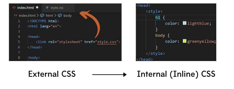
For now, it’s important to understand the difference between external and internal CSS.
External CSS is located in a separate file called a stylesheet.
To use the stylesheet you place a link to it in the head tag of the HTML markup like this:

The browser has to locate and download the file before rendering the page.
External CSS stylesheets are the industry standard. They're easier to maintain and more convenient to work with.
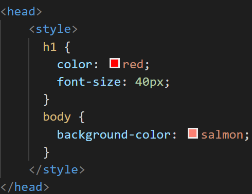
Internal CSS, on the other hand, is placed in the head tag of the HTML file within a style tag.

Now, there’s a difference between internal and inline CSS. But to keep things simple, I’m referring to all CSS, placed inside the HTML markup as inline CSS.
In terms of writing and maintaining your websites’ code, inline CSS isn’t a good practice.
But if you know what you’re doing, you can improve your page speed and user experience by delivering Critical CSS this way.
Let’s see why.
Why Is Critical CSS Important For Page Speed & UX?
Browsers must load, parse and execute all CSS files referenced in the head tag before rendering (visualizing) the page.
That’s why CSS (like JavaScript) is render-blocking by default.
And if the CSS file is too large, page speed takes a serious hit.
Also, Content Management Systems (CMS) like WordPress sometimes point to multiple stylesheets by default. And the browser has to download all of them. This destroys page speed.
So, an external CSS file can block above the fold content from appearing until the browser renders the rest of the page. This is what PSI means by "render-blocking CSS."
Actual performance isn’t the only problem, though.
Unoptimized CSS also hurts the perceived performance. This can increase bounce rate and reduce conversions.

Why?
Because users are more impatient than ever. You need to give them something to look at as quickly as possible.
This is where Critical CSS shines.
By placing Critical CSS in the head tag of our HTML file instead of in an external stylesheet, we solve both issues.
First, the browser doesn’t have to render the whole page before visualizing above-the-fold content.
It can find the Critical CSS easily because it doesn’t need to look in a separate location.
Meanwhile, our external CSS file (the non-critical CSS) becomes a bit lighter and loads asynchronously. This reduces the actual load time.
Second, we improve user experience by giving people something to look at instantly.
The entire page might take longer to load, but everything above-the-fold appears fast. And for the first few seconds, that’s all you need.
The result: your site loads faster and users have a better experience. Not too shabby.
However, setting this up isn’t as simple as it sounds.
There are two ways to set up Critical CSS:
Configuring Critical CSS Manually
The goal here is dividing your CSS into two parts – critical and non-critical.
First, you’ll need to inspect your page's Document Object Model (DOM), go through every element on the page and consider the style that's applied to it.
You'll need to do this for every page on your website.
And that’s not all.
You also have to take into account different device viewports. For example, here’s Dropbox’s homepage on desktop and mobile:

As you can see, both versions are completely different. And you'd have to set up Critical CSS for each viewport separately.
You can avoid this by choosing a point (for example 1300px) up to which all the CSS is considered critical. This isn’t a perfect solution, but it’s an easy one.
Chrome’s DevTools can also help you out with the CSS analysis.
Here's how:
Open a page you want to analyze, right-click and select “Inspect”.
Open the “Coverage” tab and click on the reload button.

After a few seconds, you’ll get a detailed report.
In the “Usage Visualization” section, you’ll find a visualization of the critical (green) vs. non-critical (red) CSS.

From here, you have to extract all of the green CSS and place (inline) it in the head tag of the HTML document.

It sounds simple, but it’s actually a lot of work.
If you want to give it a shot, Google also has other tips on analyzing and optimizing the critical rendering path.
Use A Tool To Generate Your Critical CSS
Using a tool saves you tons of time (and headaches) when configuring Critical CSS.
For example, NitroPack automatically grabs the CSS needed to visualize above-the-fold content and inlines it. Our service creates unique Critical CSS for every page (not page type).
Other tools like Sitelocity or this Critical Path CSS generator can also help you extract the Critical CSS.
You just have to enter your website’s URL and wait.

Source: Sitelocity.com
Keep in mind that the popular critical CSS generators do only that - generate the Critical CSS. They won’t set it up on your website - you’ll have to do that manually.
On the flip side, NitroPack will take care of the entire process for you.
Regardless of your choice, using a tool is far easier than doing everything manually.
What Else You Should Do To Improve Site Speed
So, now you can finally fix that annoying “render-blocking CSS” warning.
Unfortunately, Critical CSS isn’t the only thing you need to worry about.
Check out our article on Google’s Core Web Vitals, and how you can improve your site's user experience metrics.
Finally, if you want a solution that fixes all aspects of the page speed problem, take a look at NitroPack. From CSS and JavaScript minification to page caching, CDN and image lazy loading, NitroPack takes care of everything for you. Automatically!


